 11 Oct, 2026
28Views
11 Oct, 2026
28Views Cream colour tiles have a timeless appeal that can make interiors feel warm, elegant and inviting. Their soft neutral character allows them to work with a wide range of decorating styles, from modern minimalism and contemporary interiors to classic, rustic and luxury spaces.
One of the biggest advantages of cream tiles is their flexibility. They can be used on floors, walls, kitchen backsplashes, bathroom surfaces, living areas and commercial interiors. When combined with the right furniture, lighting, grout colour and decorative materials, cream tiles can create anything from a calm, natural atmosphere to a sophisticated luxury look.
For smaller interiors, lighter cream surfaces can also contribute to a brighter and more open visual impression because they can reflect available light. The result depends on the tile finish, natural lighting, room proportions and surrounding colours, but the neutral character of cream makes it an especially adaptable choice.
Whether you are planning a complete renovation or simply looking for a new flooring or wall design, cream colour tiles provide a versatile foundation that can be styled in many different ways.
Luxurious Cream Color Tiles From Antovia Surfaces
Antovia Surfaces offers surface solutions designed for contemporary residential, commercial and architectural applications. Cream-coloured surfaces can be especially useful when the objective is to create a balanced interior that feels refined without becoming visually overwhelming.
Cream shades can range from warm beige and ivory to softer off-white and stone-inspired tones. These differences may appear subtle, but they can significantly influence the atmosphere of a completed room.
• Sleek and Smooth
The finish of a cream tile has a major influence on how it looks after installation.
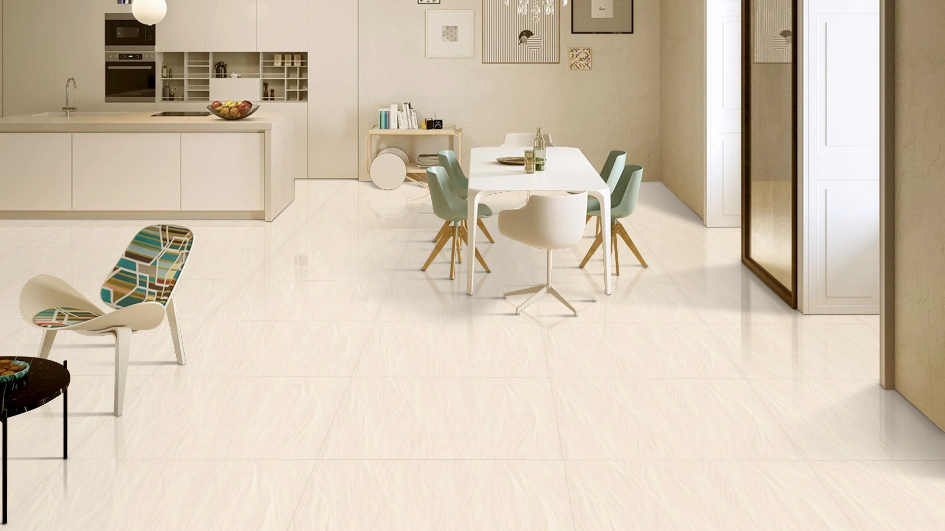
A polished or glossy cream surface can reflect light and produce a refined, luxurious appearance. It can be particularly effective in living rooms, feature areas, bathrooms and other spaces where a brighter surface is desired.
Matt and satin surfaces create a softer appearance. They can work well when the design calls for a more understated, contemporary or natural aesthetic.
When choosing a finish, consider:
-
The amount of natural light in the room
-
Artificial lighting
-
The intended application
-
Furniture and surrounding materials
-
Cleaning and maintenance requirements
-
The required technical performance of the product
A cream tile should not be selected on colour alone. The finish, application and technical specification should all be considered together.
• Endless Styling Options
Cream colour tiles can support almost any interior palette because they act as a relatively neutral visual foundation.
For a luxury interior, cream marble-look tiles can be paired with brass or gold accents. For a natural interior, cream surfaces can be combined with timber, greenery and earthy colours. A contemporary room can use cream with charcoal, black or navy accents for stronger contrast.
Cream tiles can also be used in different formats and patterns. Large rectangular tiles create a clean, spacious visual effect, while smaller formats, mosaics and decorative shapes introduce more detail.
This flexibility makes cream tiles for home suitable for living rooms, bedrooms, kitchens, bathrooms, hallways and feature walls.
• Built to Last
The durability and maintenance characteristics of a tile depend on its specific construction, finish and technical specification rather than its cream colour alone.
For flooring, consider expected traffic, surface characteristics, cleaning requirements and application suitability before selecting a product.
For commercial spaces, the selection should also consider the intensity of use and project requirements.
The important point is to match the product specification to the application rather than assuming that every cream tile will perform in exactly the same way.
Antovia Surfaces Tile Series for Cream Color Tiles
Cream colour tiles can be created through different surface treatments, patterns, textures and visual effects. The right choice depends on whether the objective is a plain neutral background, a decorative feature or a natural stone-inspired appearance.
• Carving Series
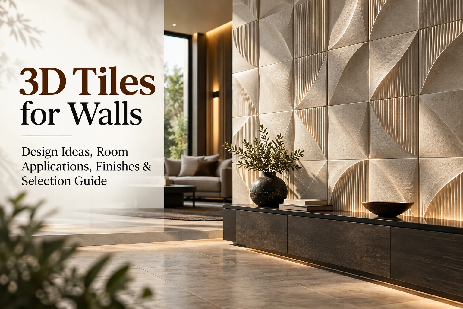
Carved and textured surfaces can introduce depth to an otherwise neutral cream interior.
A cream textured tile can be used as a feature wall where the objective is to add visual interest without introducing a strong contrasting colour.
This approach can work particularly well in living rooms, bedrooms, reception areas and selected bathroom or hospitality applications.
• Matt Series
Matt cream tiles provide a softer, understated appearance compared with highly reflective surfaces.
They can complement rustic, minimalist, contemporary and natural interior schemes. Cream matt surfaces can also be combined with natural wood, muted fabrics and earthy colours to create a calm atmosphere.
When selecting matt tiles, consider the intended floor or wall application and verify the relevant product specifications.
• Endless Series
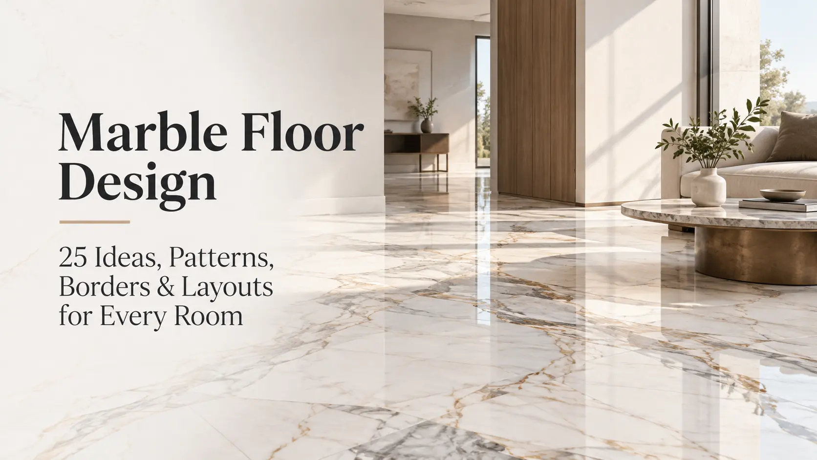
Stone-inspired and marble-inspired cream surfaces can reproduce the visual movement associated with natural materials while providing a consistent manufactured tile surface.
Subtle veining can give a cream floor more depth, while a relatively restrained pattern can maintain the calm appearance of the overall space.
Cream marble-look tiles are particularly suitable for interiors where the designer wants a luxurious appearance without relying on a strong base colour.
With different sizes, patterns, textures and finishes available across tile collections, cream surfaces can be adapted to both bold and understated interiors.
Using Cream Tiles for Floors and Walls
Cream tiles are suitable for a wide range of floor and wall applications when the selected product is appropriate for the intended use.
For flooring, larger formats can create a more continuous appearance by reducing the number of visible joints. Formats such as 600 × 1200 mm can be useful for contemporary spaces, while larger formats can create an even more expansive visual field where the room and installation conditions allow.
In smaller bathrooms, entryways and decorative areas, mosaics and smaller formats can introduce detail and make it easier to work around corners or irregular spaces.
For walls, rectangular cream tiles can create a clean and elegant appearance. They can be used across complete walls or selectively on shower surrounds, backsplashes and feature areas.
Cream wall tiles can also be combined with textured or decorative surfaces to prevent a neutral interior from appearing flat.
For example:
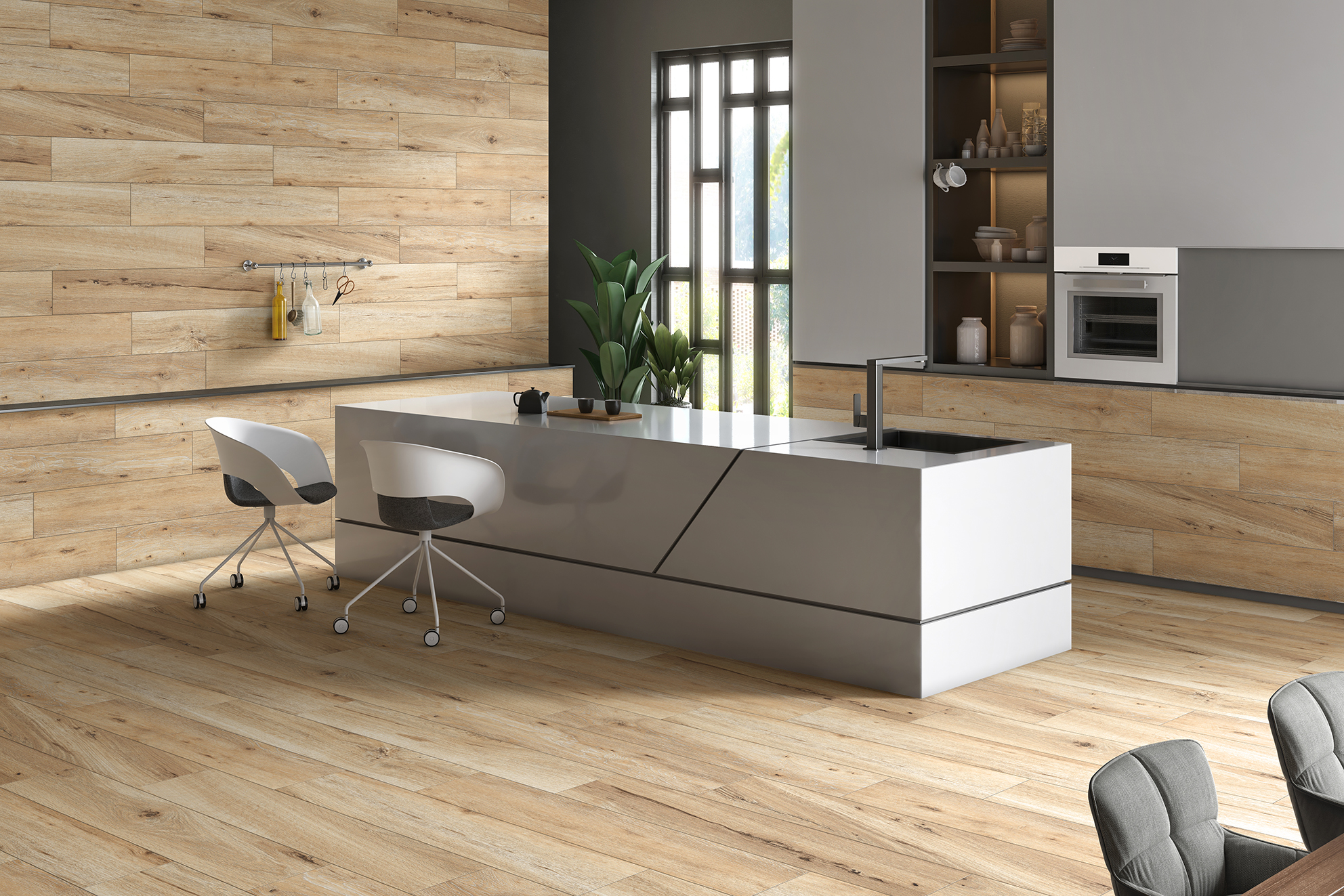
Cream floor + cream wall + wood accents creates a warm natural interior.
Cream floor + white wall + brass details produces a lighter luxury look.
Cream floor + charcoal feature wall + black fixtures gives the room stronger contemporary contrast.
When using cream tiles on both floors and walls, grout selection is also important. A closely matching grout can create a more continuous appearance, while a contrasting grout makes the tile pattern more visible.
Benefits of Using Cream Color Tiles
Cream colour tiles offer several advantages when incorporated into a well-planned interior.
Their neutral character allows them to work with changing furniture and decorative colours. This is particularly useful for homeowners who may update furniture, artwork or accessories over time.
Their lighter appearance can also help create a brighter visual atmosphere, particularly when combined with appropriate lighting.
Other benefits include:
-
Versatility: Cream works with modern, classic, minimalist and natural interiors.
-
Warm appearance: Cream generally feels softer than stark white.
-
Easy coordination: It can be combined with wood, stone, metal and many accent colours.
-
Design flexibility: Cream is available in plain, marble-look, stone-look, textured and decorative styles.
-
Floor and wall applications: Suitable products can be used across different areas of an interior.
-
Long-term design appeal: Neutral surfaces can remain compatible with changing interior trends.
However, performance should always be assessed according to the individual product's technical specifications.
Create Spacious Interiors with Cream Tiles
One reason cream tiles are frequently selected for smaller interiors is their ability to contribute to a brighter, more open visual impression.
Light-coloured surfaces can reflect available light, helping the room feel less visually enclosed. This can be useful in compact bathrooms, kitchens, bedrooms, hallways and living areas.
To strengthen this effect, consider combining cream tiles with:
-
Light-coloured walls
-
Large or appropriately scaled tile formats
-
Low-contrast grout
-
Simple furniture
-
Reflective or well-positioned lighting
-
Limited visual clutter
-
Consistent flooring between connected areas
Tile format also matters. Larger tiles can reduce the number of visible grout lines, creating a more continuous visual surface. However, the appropriate format depends on the room, installation conditions and product specification.
Cream does not automatically make every room look larger. Dark furniture, poor lighting, excessive pattern and strong grout contrast can change the final appearance. The strongest results come from coordinating the complete interior rather than relying on tile colour alone.
Best Color Combinations for Cream Tiles
The right tiles colour combination can turn a simple cream surface into a highly designed interior.
|
Space |
Colour Combination for Cream Tiles |
|
Living Room |
Cream + sage green + brass + walnut |
|
Bedroom |
Cream + muted mauve + clay pink + beige |
|
Kitchen |
Cream + forest green + gold + white |
|
Bathroom |
Cream + charcoal grey + matte black + taupe |
|
Dining Area |
Cream + burnt orange + ochre + dark wood |
|
Office/Study |
Cream + navy blue + gold + natural wood |
|
Entryway/Hallway |
Cream + black + olive green + metallic accents |
Living Room
For a sophisticated living room, combine cream floor tiles with sage green walls or soft furnishings, walnut furniture and restrained brass details.
Cream marble-look flooring can also work well with neutral sofas and darker wood.
Bedroom
Cream flooring can create a calm base for muted mauve, clay pink, beige, taupe and natural wood.
For a quieter bedroom, use several related neutral shades rather than introducing many contrasting colours.
Kitchen
Cream tiles work particularly well with green kitchen cabinetry.
Forest green cabinets, cream flooring, white worktops and gold or brass hardware can create a rich yet balanced kitchen palette.
For a softer kitchen, replace forest green with sage or muted olive.
Bathroom
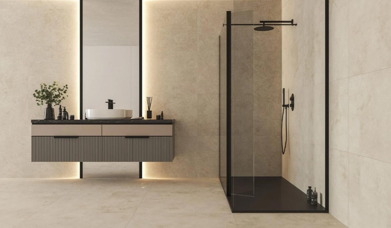
Cream tiles with charcoal grey, matte black and soft taupe can create a contemporary bathroom.
Black fixtures provide definition, while the cream background prevents the overall scheme from becoming excessively dark.
Dining Area
Burnt orange, ochre and dark wood can add warmth to a cream dining space.
This combination is particularly useful when the design aims for an earthy or welcoming atmosphere.
Office/Study
Navy blue, natural wood and restrained metallic accents provide contrast against cream flooring.
The result can feel professional without becoming overly formal.
Entryway/Hallway
Cream floor tiles combined with black door frames, olive accents and metallic details can create a strong entrance design.
For high-traffic entrances, the product should also be selected according to the expected usage and relevant technical requirements.
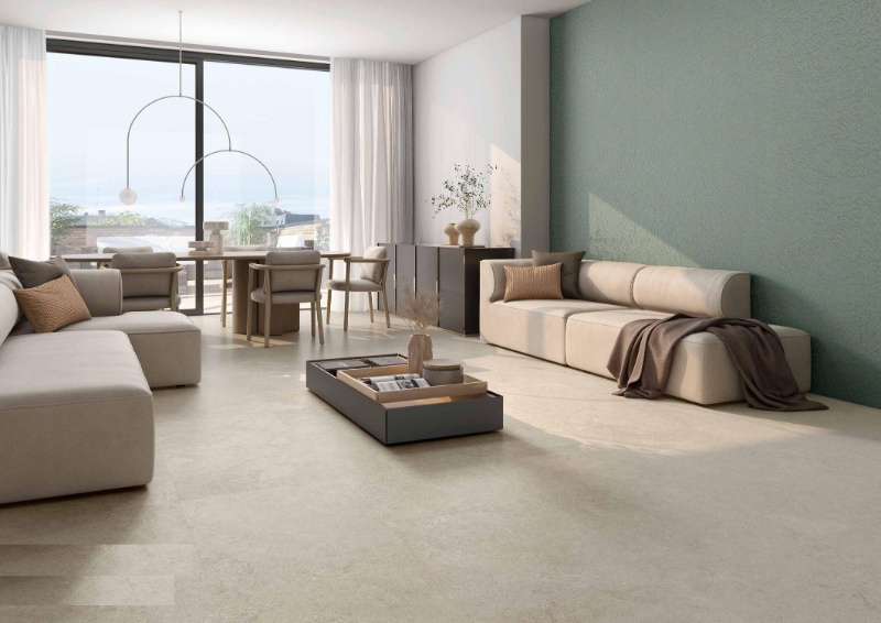
Choosing the Right Size and Shape for Flooring Applications
Tile size and shape can dramatically change how cream floor tiles appear in a room.
• Size
For smaller or medium-sized interiors, formats such as 600 × 600 mm can provide a balanced appearance.
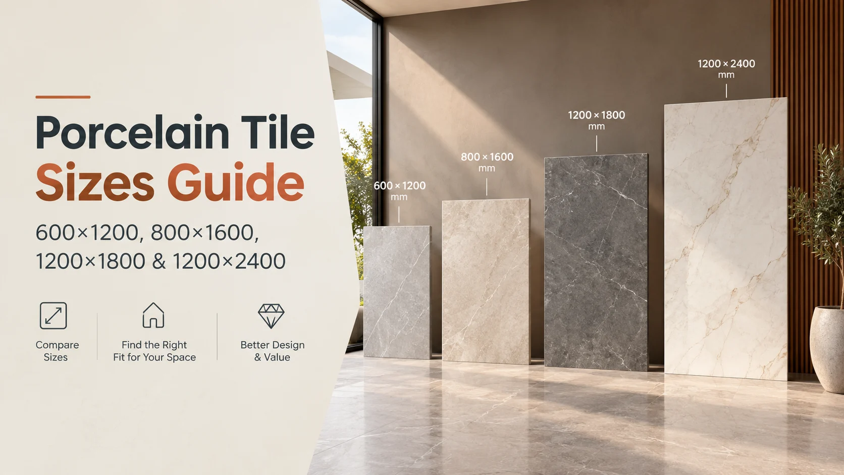
600 × 1200 mm rectangular tiles can create a more elongated visual direction and are especially suitable for contemporary interiors.
Larger formats such as 800 × 1600 mm can create larger uninterrupted visual planes in spacious areas.
Very large formats, including 1200 × 2400 mm surfaces where available and appropriate, can provide an expansive appearance with fewer visible joints.
For commercial applications, the best size should be determined according to traffic, design requirements, installation conditions and product specifications rather than size alone.
Smaller formats and mosaics can be useful in bathrooms, compact areas and locations where the surface requires more detailed layout flexibility.
The key is to choose a format that is proportional to the space.
• Shape
Square tiles create a regular and structured grid.
Rectangular tiles can make a space feel more directional and contemporary.
Hexagonal tiles introduce a distinctive geometric pattern and can work particularly well as decorative flooring or feature areas.
Chevron and herringbone layouts can add movement without requiring a completely different colour palette.
Other shapes, including triangles or decorative mosaics, can be used selectively in feature areas.
When mixing shapes, avoid introducing too many unrelated patterns. A more successful approach is to keep the colour family consistent while allowing the shape or layout to provide visual variation.
Choosing Tile Size by Room
|
Room |
Suitable Design Direction |
|
Small Bathroom |
Smaller format or mosaic |
|
Medium Bedroom |
600 × 600 or rectangular format |
|
Living Room |
600 × 1200 or larger where suitable |
|
Large Open Area |
Large-format rectangular tile |
|
Hallway |
Rectangular format or coordinated layout |
|
Commercial Space |
Format selected according to traffic and specification |
The right size ultimately depends on the room dimensions, layout, installation requirements and the appearance you want to achieve.
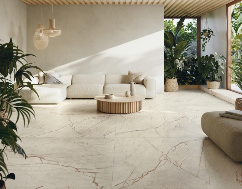
Cream Tile Colour Combinations by Interior Style
Cream tiles can be adapted to different design languages simply by changing the surrounding materials.
Modern
Use cream with charcoal, black, grey and clean-lined furniture.
Minimalist
Combine cream with white, light wood and limited decorative elements.
Luxury
Choose a cream marble-look surface with restrained brass, gold or dark wood accents.
Natural
Pair cream stone-look tiles with timber, greenery, rattan and earthy colours.
Classic
Use warm cream with walnut, beige fabrics and traditional furniture.
Contemporary
Combine cream with navy, muted green, taupe or dark architectural elements.
This approach makes it easier to select a cream tile colour combination according to the desired style rather than choosing colours independently.
How to Choose the Right Grout Colour for Cream Tiles
Grout can have a surprisingly large influence on the final appearance of cream flooring and walls.
A cream or beige grout close to the tile colour reduces visual interruption and can create a more continuous surface.
A light grey grout provides subtle definition.
Dark grey or charcoal grout creates stronger joint lines and gives the installation a more graphic appearance.
Black grout creates a dramatic contrast and can be effective in selected modern designs.
The final choice should consider the tile pattern, room size, maintenance expectations, joint width and overall design.
Cream Tiles for Small and Large Rooms
Cream tiles can work in both compact and expansive interiors, but the design strategy should change.
In a small room, lighter cream surfaces, coordinated grout and carefully selected formats can help create a cleaner visual flow.
In a large room, cream tiles can become the foundation for stronger furniture and architectural features. Large-format tiles can also reduce visual interruption and create a more continuous floor.
In open-plan spaces, using a consistent cream surface across connected areas can help visually connect the zones.
Cream Marble-Look Tiles for Modern Interiors
Cream marble-look tiles combine the warmth of cream with the movement of marble-style veining.
They can be used to create:
-
Luxury living room floors
-
Elegant bathroom walls
-
Feature walls
-
Premium entrance areas
-
Hotel interiors
-
Reception spaces
-
Kitchen backsplashes
The amount of veining should be selected according to the rest of the room. If the tile has dramatic movement, keep furniture and decorative elements relatively restrained.
For a minimalist luxury interior, subtle veining may be more effective than a highly contrasting pattern.
Cream Tiles Floor and Wall Matching Ideas
Using cream on both the floor and wall does not necessarily mean using the exact same product everywhere.
A coordinated design can use:
Same colour + different format
Large cream floor tiles with smaller rectangular wall tiles.
Same colour + different finish
Matt flooring with a more reflective wall surface.
Same colour + different texture
Plain cream flooring with a textured cream feature wall.
Cream floor + contrasting wall
Cream flooring with sage, taupe, charcoal, white or navy wall elements.
This creates visual hierarchy while maintaining the warmth of the cream palette.
Common Cream Tile Design Mistakes to Avoid
Avoid selecting a cream tile solely from a photograph. Different lighting conditions can change how cream appears.
Also avoid mixing cream tiles with significantly different undertones without checking them together first.
Other common mistakes include:
-
Using too many accent colours
-
Ignoring grout colour
-
Choosing a format that is unsuitable for the room
-
Mixing too many patterns
-
Ignoring natural and artificial lighting
-
Selecting a finish without considering the application
-
Assuming every cream tile has the same performance
-
Forgetting to coordinate adjoining rooms
-
Choosing furniture before considering the tile undertone
-
Not checking the product's technical specification
A physical sample can be especially useful when colour matching is important.
Cream Tile Selection Checklist
Before finalising your cream tiles, check:
-
Colour: Is the undertone warm, neutral or cool?
-
Application: Is the product suitable for the floor, wall or both?
-
Size: Is the format appropriate for the room?
-
Finish: Does the surface finish suit the intended design?
-
Pattern: Is the veining or texture appropriate?
-
Grout: Do you want the joints to blend or contrast?
-
Lighting: How does the tile look in natural and artificial light?
-
Furniture: Does it coordinate with existing materials?
-
Maintenance: Are the cleaning requirements appropriate?
-
Technical specifications: Does the product meet the project's requirements?
Conclusion
Cream colour tiles are a versatile choice for creating warm, elegant and adaptable interiors. Their neutral character allows them to work with modern minimalism, classic interiors, natural materials and luxury design schemes.
They can be used across living rooms, bedrooms, kitchens, bathrooms, hallways, entrances and commercial environments, provided the selected product is appropriate for the intended application.
The best results come from looking beyond colour alone. Tile size, shape, finish, grout, lighting, furniture and surrounding materials all influence the final design.
For a natural interior, combine cream with wood and greenery. For a contemporary room, introduce charcoal, black or navy. For a luxury appearance, consider marble-look cream surfaces with restrained metallic accents.
The flexibility of cream also makes it easier to update a room over time. Furniture, accessories and accent colours can change while the neutral tile foundation continues to work with the new design.
By considering the colour undertone, room size, tile format, application requirements and complete interior palette, you can select cream floor and wall tiles that are not only attractive but also appropriate for the space.
FAQs About Cream Colour Tiles
Are cream colour tiles good for floors?
Yes. Cream colour tiles can work very well for flooring when the selected product is suitable for the intended application. Their neutral appearance makes them easy to coordinate with furniture, walls and other materials.
What colours go well with cream tiles?
Cream works well with white, beige, taupe, brown, walnut, sage green, forest green, navy, charcoal, black, brass and natural wood.
Are cream tiles suitable for small rooms?
Yes. Light cream surfaces can contribute to a brighter and more open visual impression, especially when combined with appropriate lighting and coordinated grout.
What grout colour is best for cream tiles?
Cream or beige grout can create a seamless appearance. Light grey provides subtle definition, while charcoal or black creates stronger contrast.
Are cream tiles good for living rooms?
Yes. Cream tiles provide a neutral foundation that can work with modern, traditional, minimalist and luxury living room designs.
What wall colour goes with cream floor tiles?
White, beige, taupe, sage green, olive, navy and selected earthy colours can all work with cream flooring. The tile's undertone should be considered before selecting the final wall colour.
Do cream tiles make rooms look bigger?
Cream and other light-coloured surfaces can help create a brighter and more spacious visual impression by reflecting available light. The overall effect also depends on room proportions, lighting, furniture and grout.
Which size is best for cream floor tiles?
There is no single best size. 600 × 600 mm is versatile, while 600 × 1200 mm and larger formats can create a more continuous contemporary appearance when appropriate for the space and installation.
Are cream marble-look tiles suitable for luxury interiors?
Yes. Cream marble-look tiles can provide a sophisticated appearance through the combination of a warm neutral base and marble-style veining.
Can cream tiles be used on walls and floors?
Some products are suitable for both applications, but this should always be confirmed from the specific product's technical specifications.
Are cream tiles outdated?
No. Cream is a timeless neutral. Modern formats, marble-look designs, textured surfaces and contemporary colour combinations can give cream tiles a very current appearance.
How do I choose the best cream tiles for my home?
Start by considering the room, application, lighting and existing materials. Then select the appropriate cream undertone, size, finish, pattern and grout. Always confirm that the specific product is suitable for the intended application.